VeloraDAO Expense Dashboard

As we mentioned in our first GTF quarterly report, the SEEDGov team has developed the VeloraDAO Expense Dashboard, a tool to track DAO expenses as a means of ensuring transparency and accountability. The intention is to make it a living document that evolves based on community iteration and feedback.

To view it, you must have an Airtable account and request access.

In the top-left menu, you’ll find access to three tabs, which we describe below:

DIP

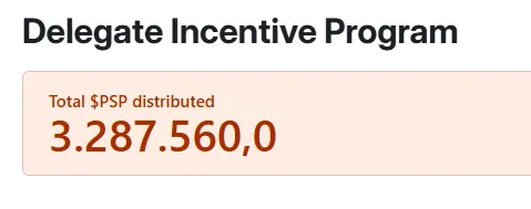
In the first tab, titled “DIP”, you’ll find at the top the total amount of PSP effectively distributed through the Delegate Incentive Program to date.

Below the header, you’ll see the total amount of PSP effectively distributed to each delegate.

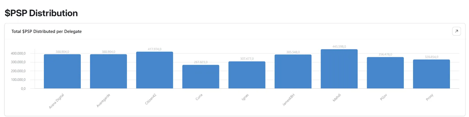
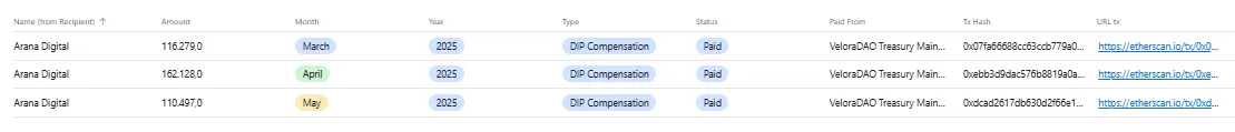
By clicking on a delegate’s bar, a menu will appear showing the details of each transfer: the amount of PSP per transaction, month and year, concept, the origin wallet, the hash and the hash link for each payment.

Further down, a pie chart visually displays the percentage of PSP received by each delegate. Just like the previous chart, clicking on a delegate’s section reveals the full breakdown of all related transactions.

Further down, there is a chart showing the amount of PSP distributed by month.

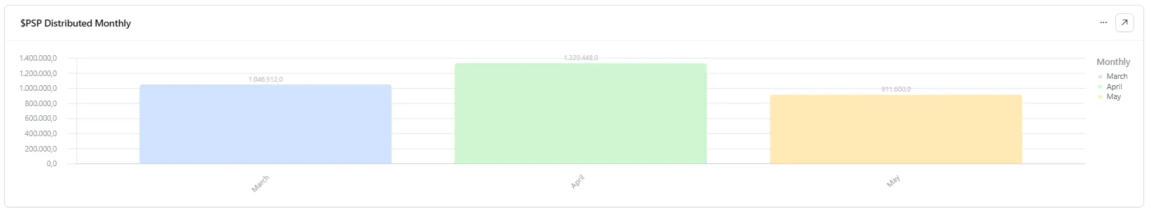
By clicking on each month, a menu expands displaying the details of the transfers: recipient, amount, month and year, concept, origin wallet, and the transaction hash.

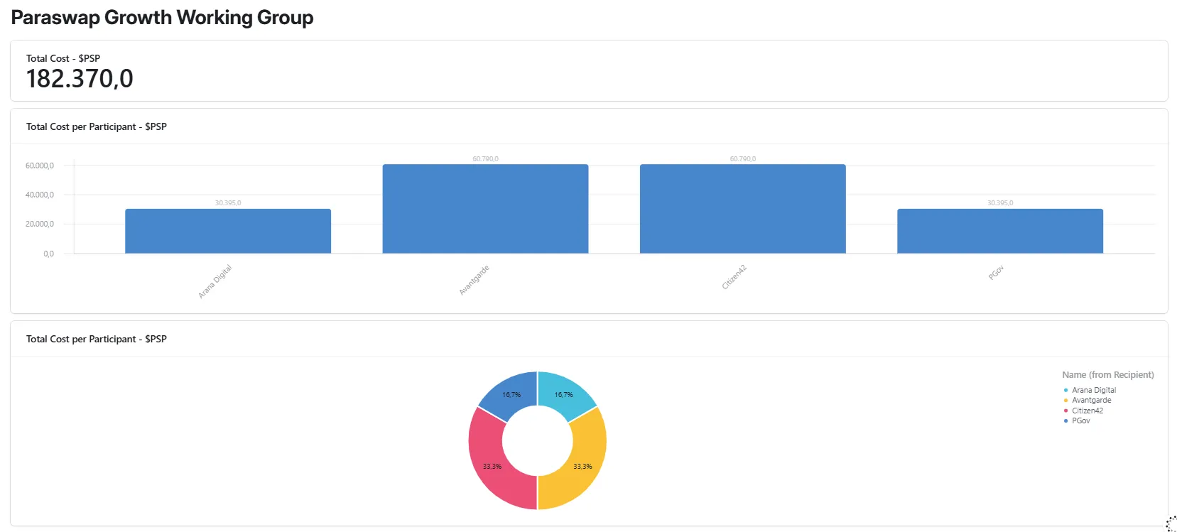
Finally, this same page includes the PSP distributed to the PGWG, a now-dissolved working group. Both a bar chart and a pie chart display the total PSP received by each member. Clicking on each section reveals the details of every transaction.
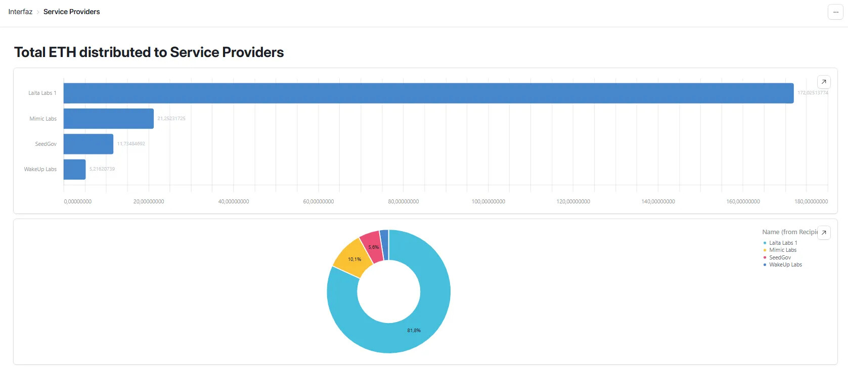
Service Providers

This section allows you to track the payments received by each Service Provider, broken down by token.

The first set of charts, both bar and pie, displays the total ETH distributed to each Service Provider.

The second set of charts shows the total PSP distributed to each provider.

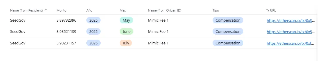
By clicking on a bar or pie slice, a menu opens with the details of all transfers received by that Service Provider, including token amount, year, month, payment origin wallet, concept, and transaction hash.
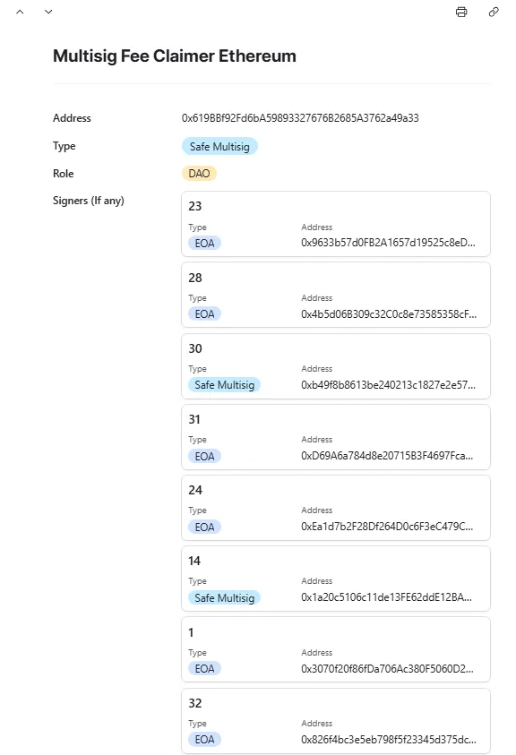
Address Book

Finally, this section contains a complete list of all wallet addresses involved in DAO expenses, including those of each delegate, Service Provider, the DAO wallets from which payments originate, and the DAO wallet signers.

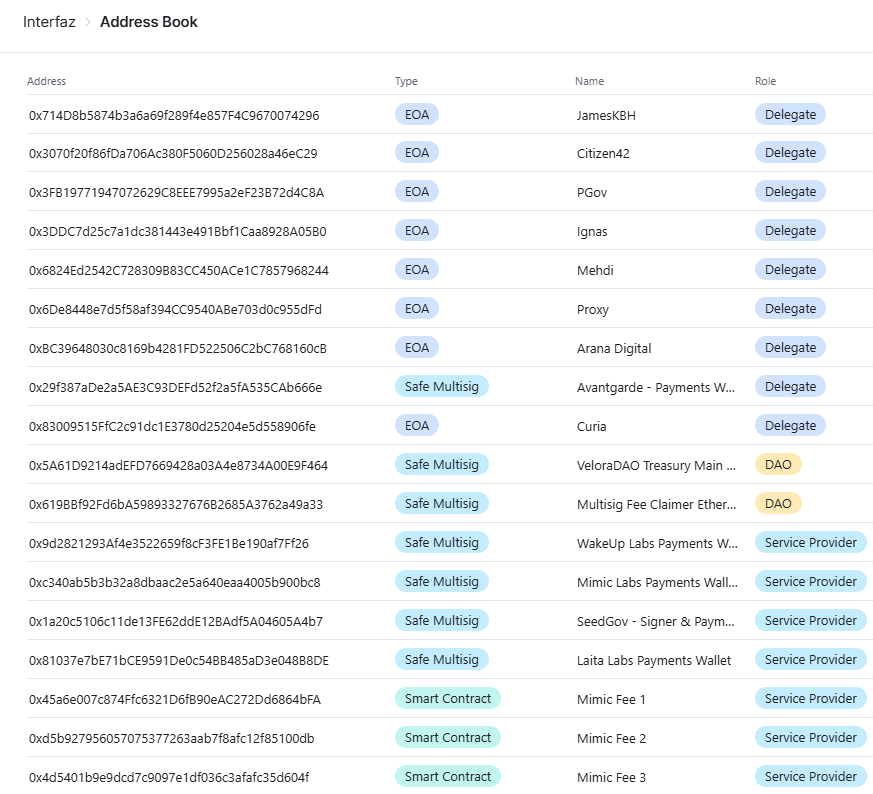
By clicking on each address, a dropdown menu appears that allows you to copy the address, and in the case of DAO multisigs, it also displays the list and details of all associated signer wallets and by clicking on each of them, more information is displayed.

Final Considerations

This dashboard will be continuously updated as the DAO executes new spending transactions.

Our goal is for this to be a dynamic, evolving tool that adapts to the DAO’s changing needs. We are fully open to iteration, feedback, and suggestions from the community to improve it and add useful information.

If Airtable proves insufficient in the future, we are open to migrate the dashboard to a more suitable platform in case any DAO member has a better recommendation about it.

We offer this tool as part of our commitment to transparency and accountability — values we uphold as core principles at SEEDGov. We hope this dashboard becomes a go-to reference for both DAO members and external stakeholders. Our vision is for VeloraDAO to be a benchmark in DAO transparency.


Open an account in Airtable and request access to consult the VeloraDAO Expense Dashboard.

8 Likes

Nice work on this. I just requested access to check it out further.

Thanks to @SEEDGov for all the work you are doing to up level our work here at Velora!

1 Like

Neatly put together @SEEDGov :saluting_face:

1 Like

Thank you @SEEDGov for this, we believe this is a great start to bring greater clarity to the DAO’s finances.

In the near future, you’ll see further efforts from our side on this as well. Let’s talk about how we could merge these initiatives to have a balance sheet sort of dashboard with both assets, revenue and costs.

4 Likes

That is good news!

If possible, create this dashboard on Dune, as it is a platform other parties will be able to extract information more easily, and build new queries/dashboards from this source of information!

1 Like

Thanks for the feedback.
We are evaluating with the SEEDGov data analyst the possibility of developing a dashboard in Dune that automatically collects on-chain data. At the same time, we are exploring the best way to incorporate those elements that necessarily require human input—such as categorizing each transaction based on its purpose or context.

4 Likes

This Expense Dashboard is a huge step forward for transparency and community insight, huge props to @SEEDGov team! We have requested access and are excited to dig in further. From the images, the interface seems clean and intuitive, with clear visualizations that make it easy to understand where funds are going. The interactive filters by category and timeframe, along with the month-over-month breakdowns, help stakeholders quickly analyze trends. It’s clear that a lot of thought went into making the data both accessible and actionable—great work by the team.

Look around and seeing the comments, we second that some small contextual notes or tooltips for each category (e.g., “Developer Ops” or “Community Grants”) would help community members better understand line items at a glance. Including variance alerts or highlighting when a category exceeds budget expectations could provide proactive oversight, while simple export options (CSV/XLS) and trend indicators like a rolling 3-month average would empower deeper analysis.

Overall, again, huge kudos to the team!

2 Likes

The dashboard demonstrates a high standard of transparency, with clear, well structured data and strong accessibility. Great work!

3 Likes

The dashboard is great and gives us a clear overall view of the expenses. The Airtable UI is also really nice. It would be great if you could include the dollar amounts of the payments in the dashboard. Thank you!

Nice work!

Thanks for the updates @SEEDGov.

Thanks for this @SEEDGov , good to have this level of transparency, I just requested access now.

Thank you for the great work, @SEEDGov !

This dashboard is extremely useful as a data resource. To be candid, it would be even more valuable if we could also see DAO-level cash flow, treasury balance trends, and, by extension, runway estimates. That would give a clear picture of the DAO’s overall financial health.

We wanted to ask if adding this type of view might be possible. From our perspective, this is a necessary component for proper budgeting and for supporting DAO programs in a responsible way. If these metrics could be incorporated into the existing dashboard, it would be greatly appreciated.

Thank you for building the Dasboard @SEEDGov

Can you please make the Dashboard public?

- Baer.eth

This is in the works!

3 Likes

Unfortunately, Airtable does not allow open viewing without having an account and requesting read access. We are currently developing a similar dashboard in Dune, which, while making it easier to incorporate data directly from the blockchain, is more limited in terms of flexibility and the ability to integrate additional high-value data.